
Local Water
Overview
Local Water is an application that helps watersports enthusiasts plan for time spent on the water. It provides weather forecasts, river conditions, and a customizable profile to organize and quickly access waypoints saved by the user.
Purpose & Context
This is a project that I chose for my CareerFoundry UX design program. My roles included UX research and UX/UI design. The UX design process was used throughout this project, including: user research, design, testing, and implementation.
Objective
To immerse myself in end-to-end UX design by developing a responsive web app that enhances the experience of users engaging in fishing and water recreation.
Problem
It can be difficult to locate and decipher river and water conditions. Local Water users need a way to easily access and digest water and weather forecasts before or during their time on the water in order to maximize their experience; whether that is checking out new fishing spots, finding a perfect campsite for their weekend explorations, or taking the paddleboard out on the lake.
Solution
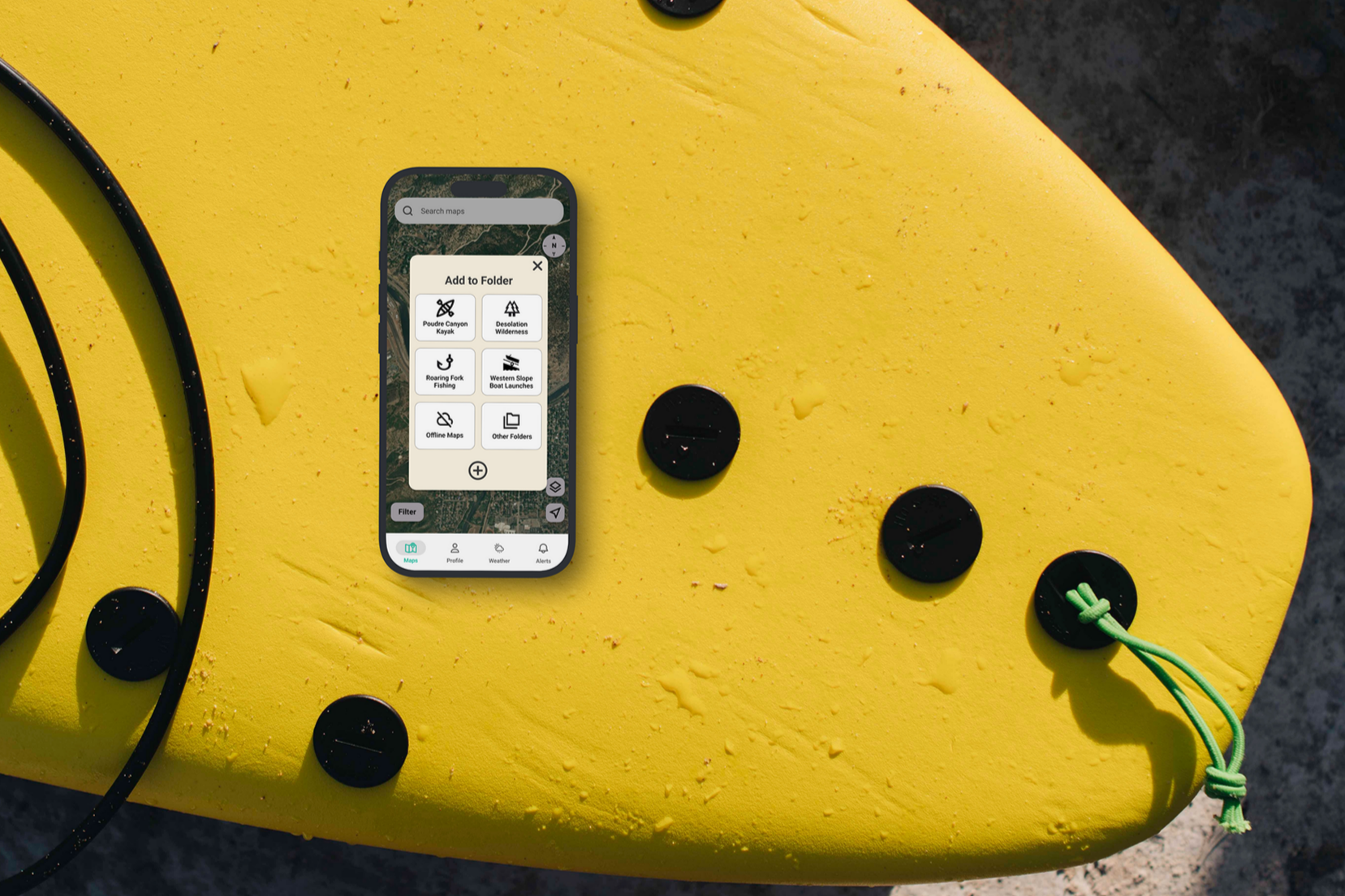
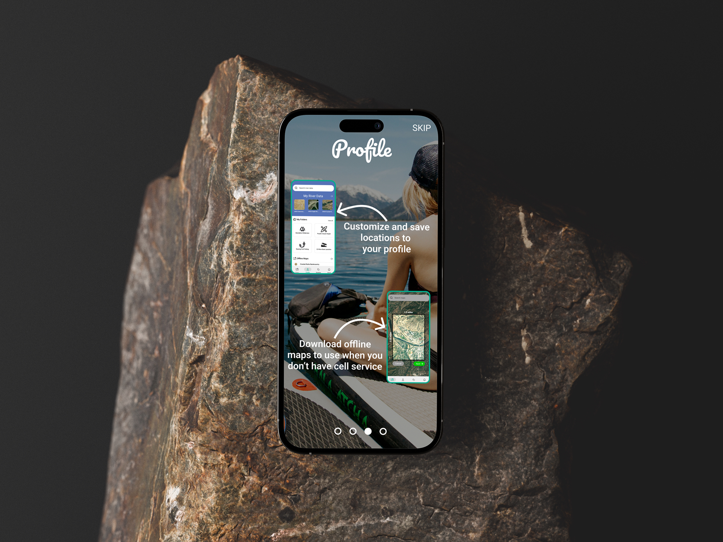
Create an app tailored to the user by allowing them to quickly find locations, river conditions, forecasts, and save data for quick access. From user research, I discovered the app needed customizable folders that the users create to organize data that is important to them.
User Research
To understand potential users better, I used methods such as interviews and affinity mapping. Before designing anything, it was important that I establish some research goals:
Discover what tasks my target user base would like to accomplish while using the Local Water app.
Identify what features my users would find most compelling and helpful towards their goals.
Learn more about what existing apps, if any, they currently use to accomplish these goals and if they have any pain points or aspects they wish were different.
Interviews
I interviewed a small demographic of river-goers. I asked all of them about 12 questions with follow-up on a few of them. As the interviews went on, other questions arose, which led to more discovery and insight. The interviewees ranged in age from 30-40 years old and come from different background professionally.
Key takeaways from interviews:
Users don't use just one app or website.
There is minimal usage of any apps while users are in the field.
Simplicity and digestibility of information is a current pain point.
All users trust and use USGS water gauges.
Affinity Mapping
Affinity mapping helped me organize and digest all the information I had gathered from my rounds of interviews.
Affinity Mapping Insights
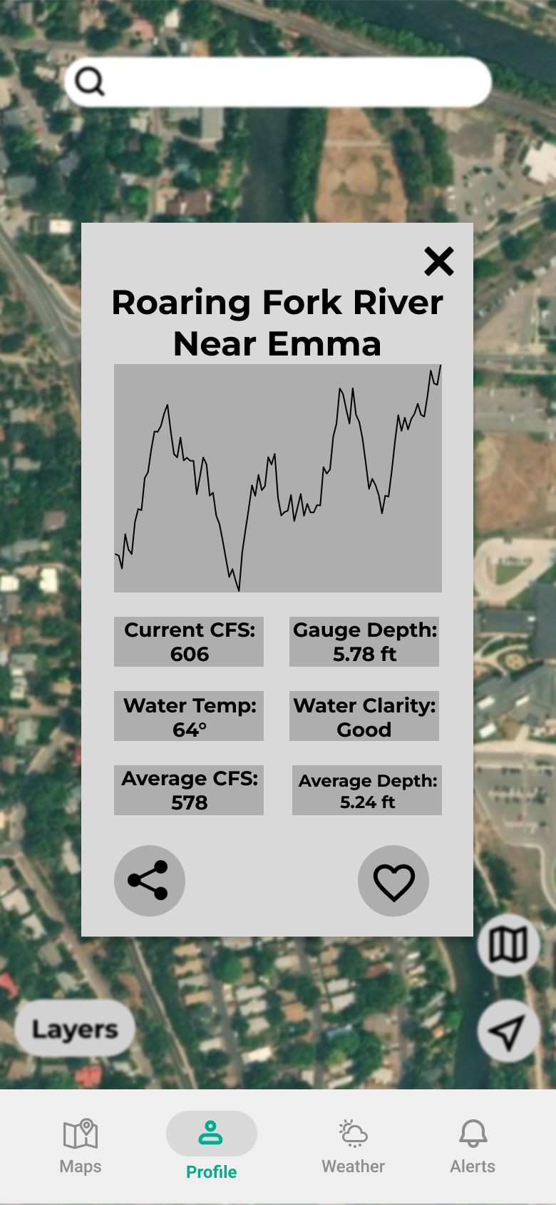
River flow rate, water temperature, and weather were mentioned as being important.
The USGS users had trouble reading the data presented and the overall functionality of the website.
Users desired to have an interactive map with search bar that is easy to read and find nearby places.

User Personas
Taking the insights I gained from interviews, I created 2 personas that would help me facilitate creating user-focused designs. Stepping into the shoes of the personas, I could better understand and make design decisions based on our target demographic.


User Journeys
To better understand one of my personas, Michelle, I created a realistic scenario of something she might use the Local Water app for. This gave me insight into the emotion and decision making a user might feel as they navigate the app.


User Flows
Creating user flows allowed me to visualize the path a user would take to accomplish certain tasks.
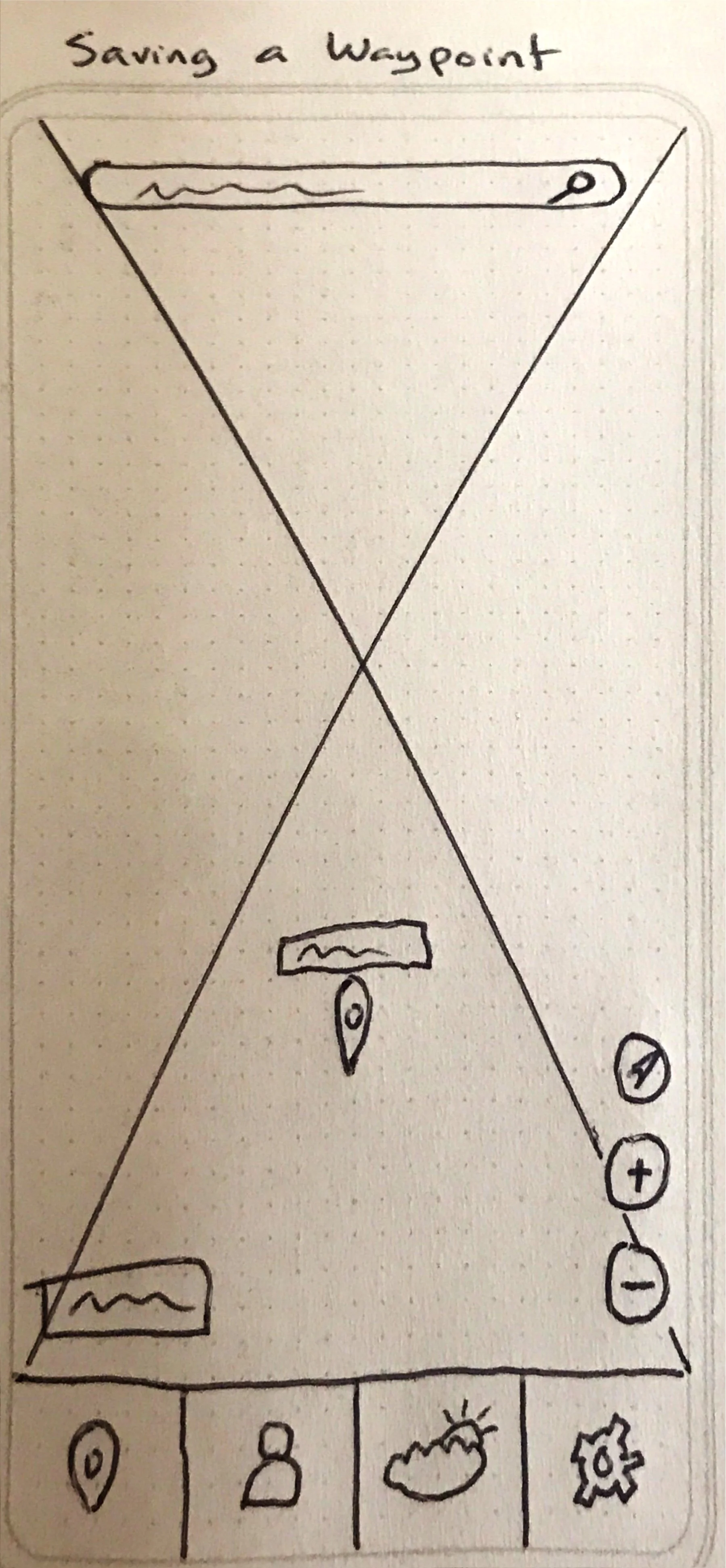
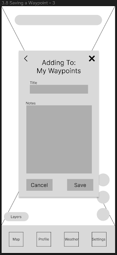
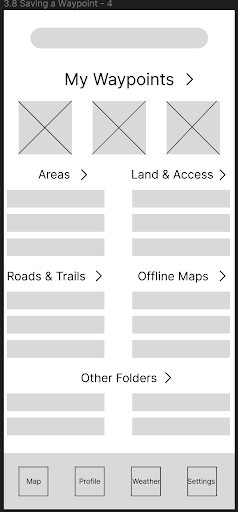
Wireframes
In order to quickly explore design ideas, I started my design process with low-fidelity sketches. Using Figma, I translated my first sketches into low-fidelity wireframes, then to mid-fidelity wireframes.


Usability Testing
At this stage, my mid-fidelity wireframes were defined enough for some usability testing. Based on 6 moderated remote tests, I discovered some needed alterations before advancing to high-fidelity wireframes. This is an example of some the issues I was able to identify and address:
Issue:
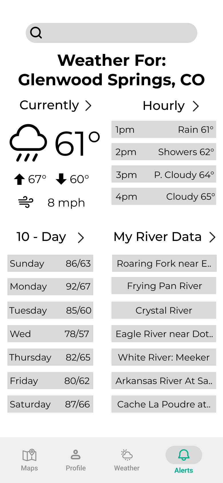
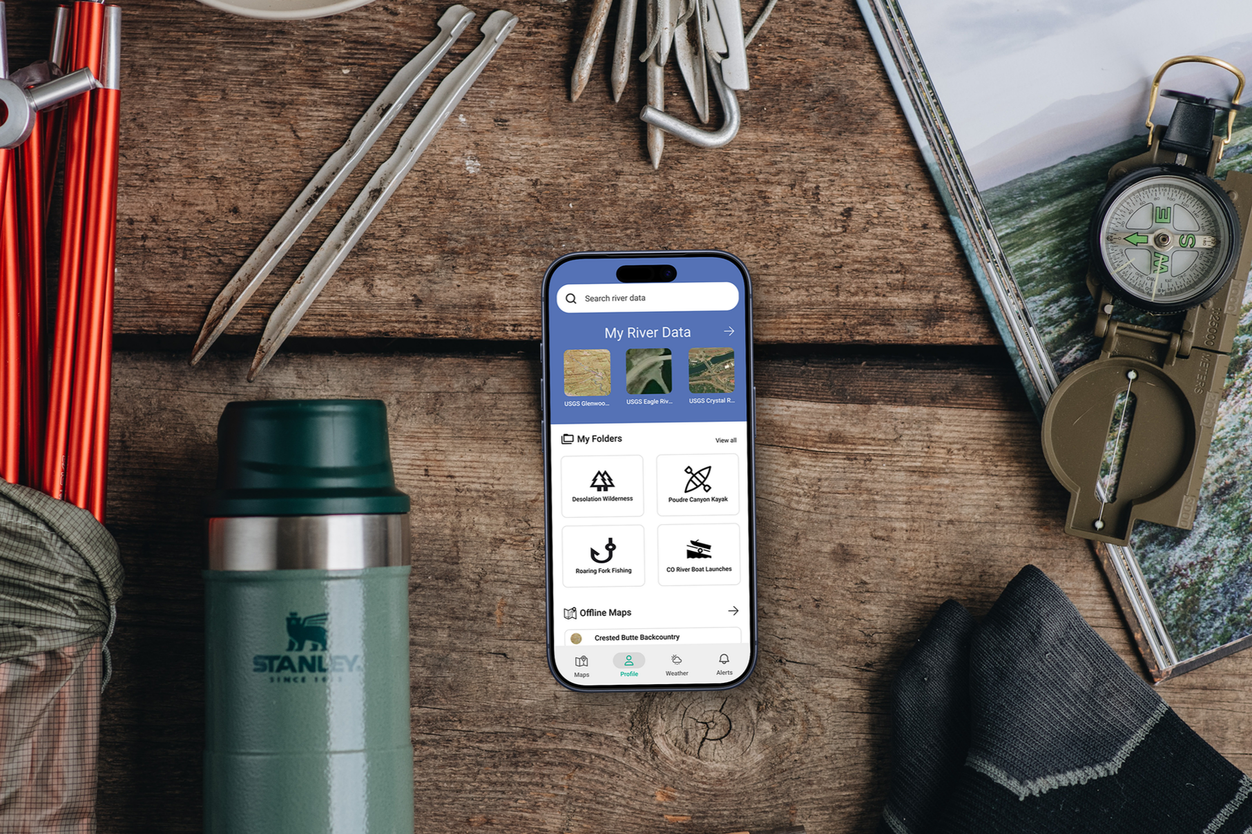
Users had trouble locating their saved river gauges
Suggested change: Move the “My River Data” function from the weather page and into the user profile
Evidence: Each user had trouble finding their saved river gauges during the first scenario task. They all first wanted to look in their profile folders before looking at the weather page. Some glanced over the weather page multiple times before realizing their river gauges were on that screen.
To see more about the usability testing for this project, follow this link:
Before
After

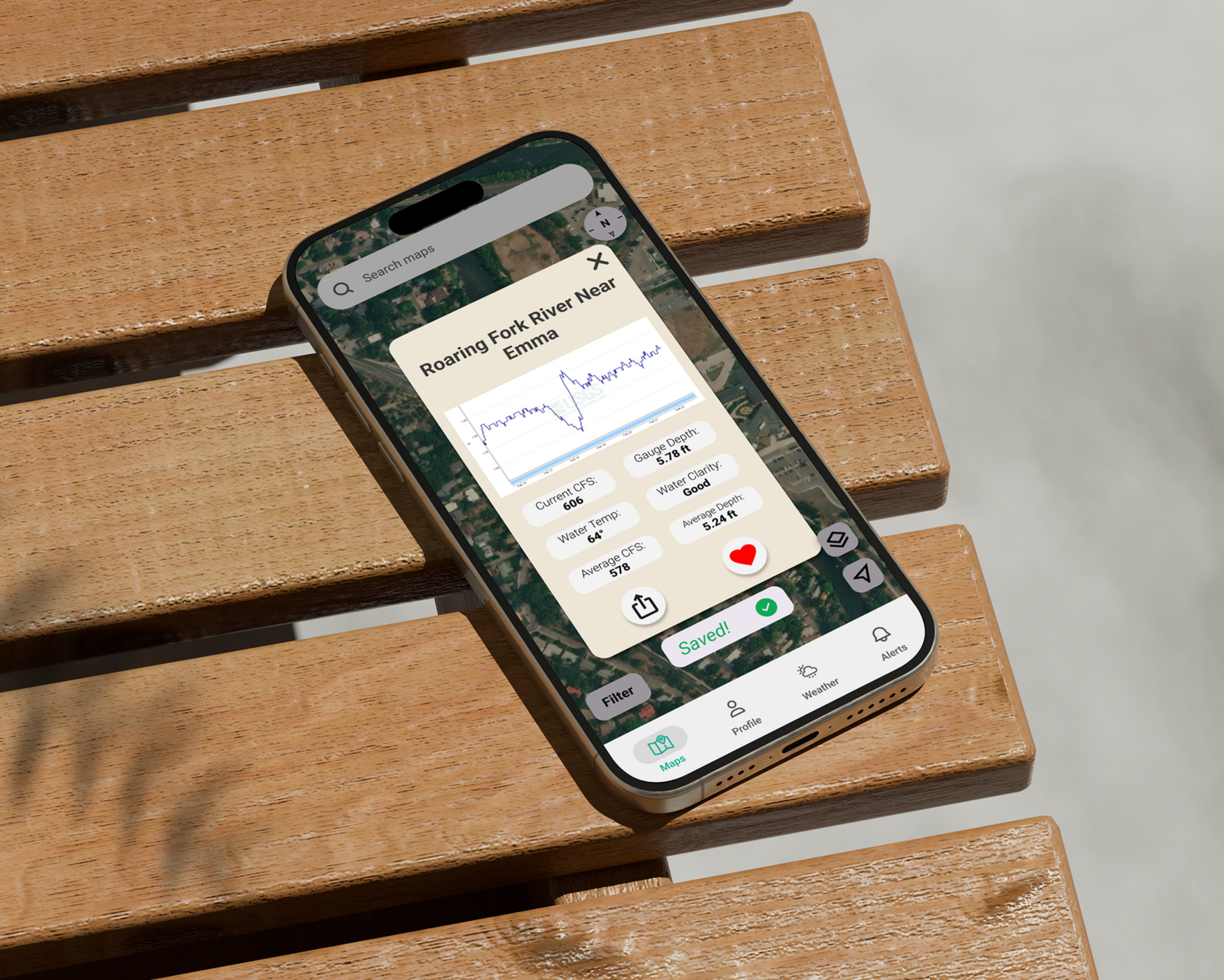
Final Mockups
After changes and improvements were made during the usability testing process, further iteration took place while referencing Material Design Guidelines as well as striving to meet WCAG.


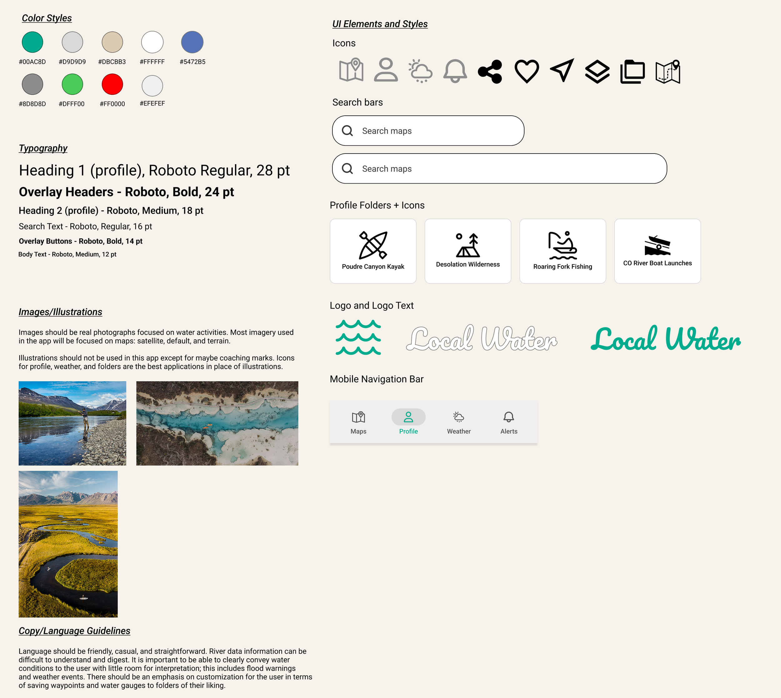
Style Guide
I created a style guide to maintain brand identity, efficiency, and consistency. This provided a more cohesive user experience and can be used by other team members for a more seamless execution.
Learnings
Throughout my first project, I've learned a lot about the design thinking process. It takes constant iteration and is not a linear process. From empathizing with the user, creating personas, keeping business goals in mind, wireframing, user testing, to meeting accessibility guidelines, I've grown a lot as a designer. My skills using Figma have also drastically improved, whether it be rapid prototyping, creating complex components, or building style guides. I've learned that user research, testing, and designing for the end user will always produce a product that is more accessible and enjoyable.